Craftnote DigiGuide
About the project
The DigiGuide is a free virtual learning space for craftspeople that provides guidance with digitization related topics. Different experts provide educational content of varying length consisting of both video and text.
The goal and strategy behind it
But why should a Startup like Craftnote bother with creating and maintaining a free learning platform? This might not seem rational at first, but when you look a bit closer you will understand why this is actually a very smart move:
- Through a learning platform like this Craftnote is positioning themselves as experts in the very space they are serving with their app without having to create content by themselves.
- They are bulding up a relevant network.
- Most importantly though: They are driving traffic to their app and can use this as an entry point for their funnel: People interested in free content around digitizing their business in this sector will with a high certainty also need a solution like Craftnote.
Concept & Desk Research
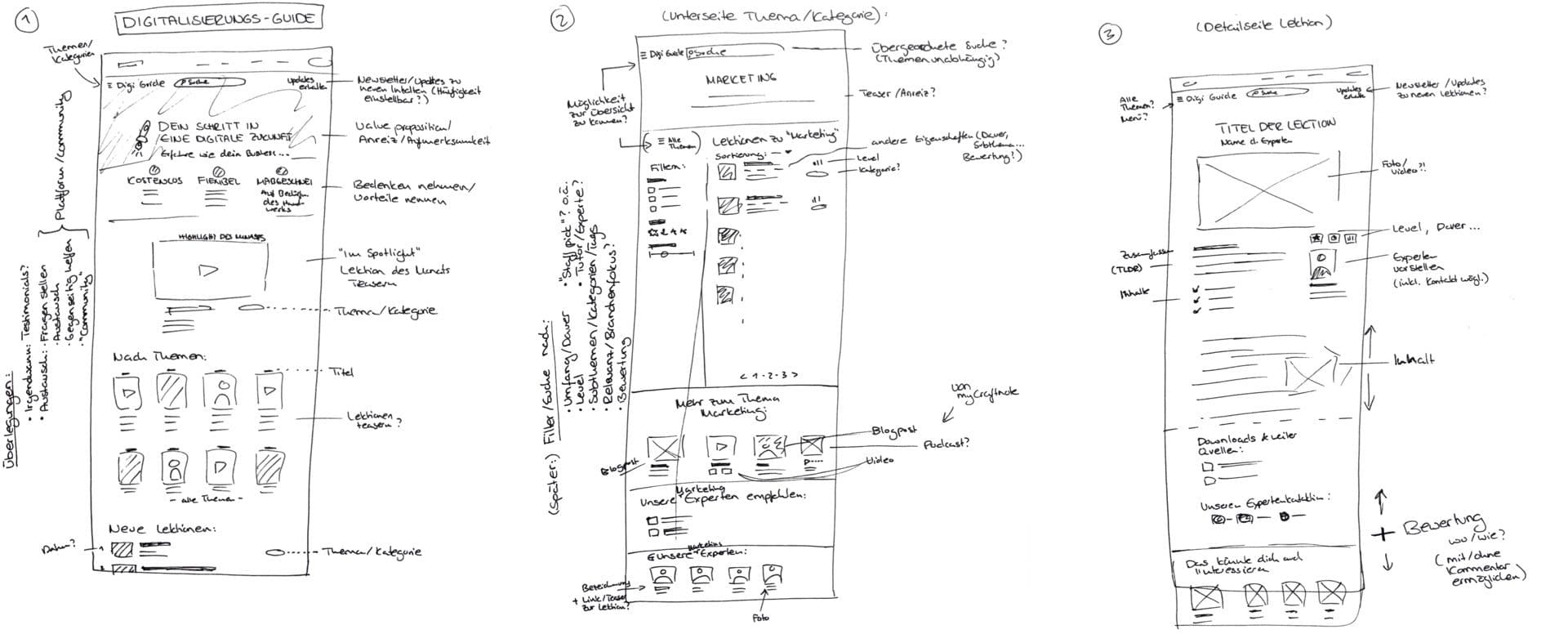
These strategic thoughts were what led my thinking and decission making when it came to proposing a concept for the DigiGuide. As always, I started with research – in this case that mainly meant sifting through the web for online education platforms such as Skillshare. I don't spend too much time on that and normally quickly sketch out my first thoughts and ideas in order to be able to communicate them to the team.
UI Design
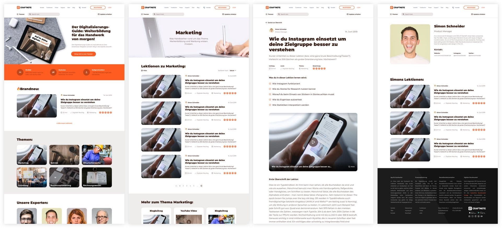
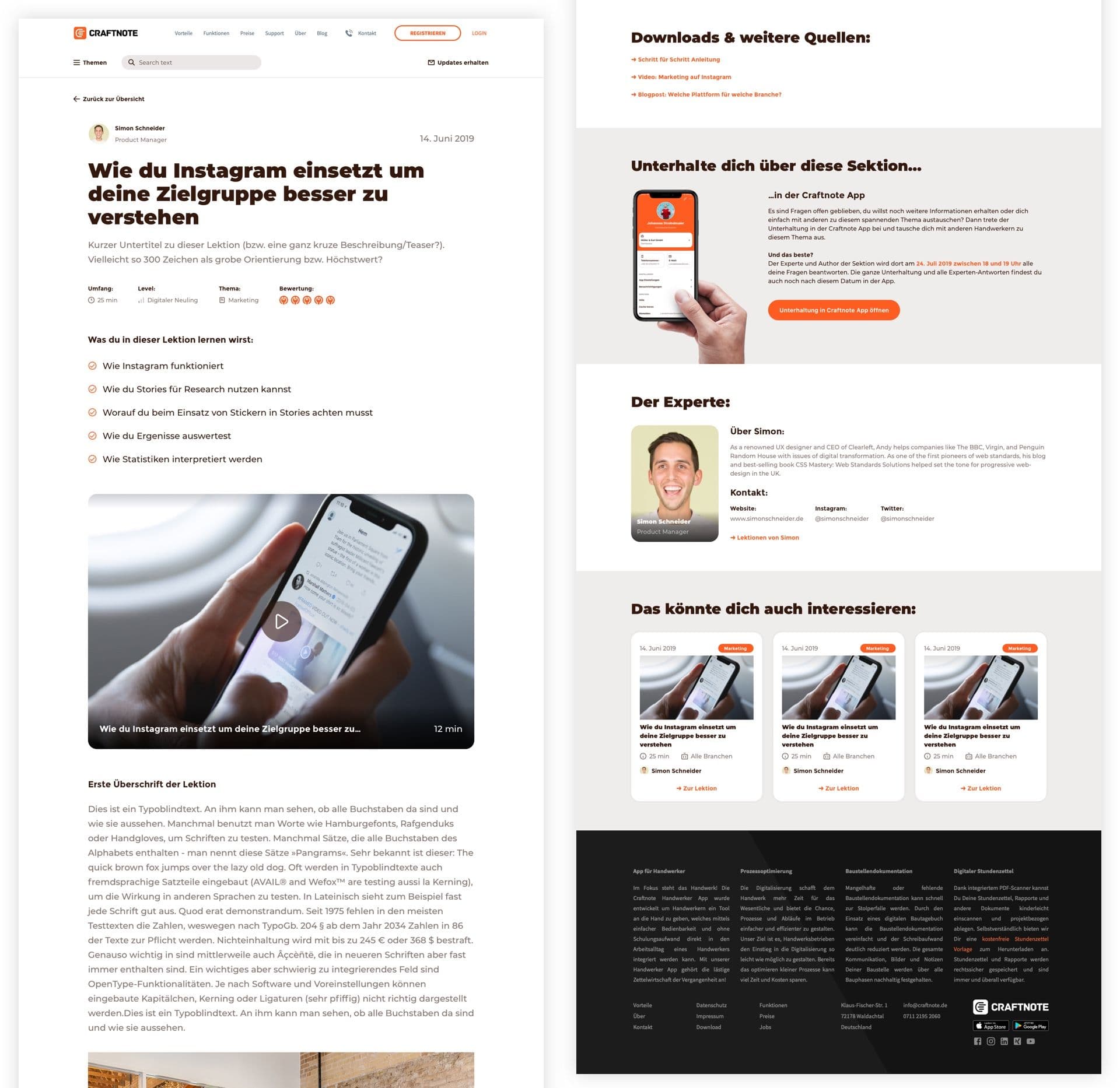
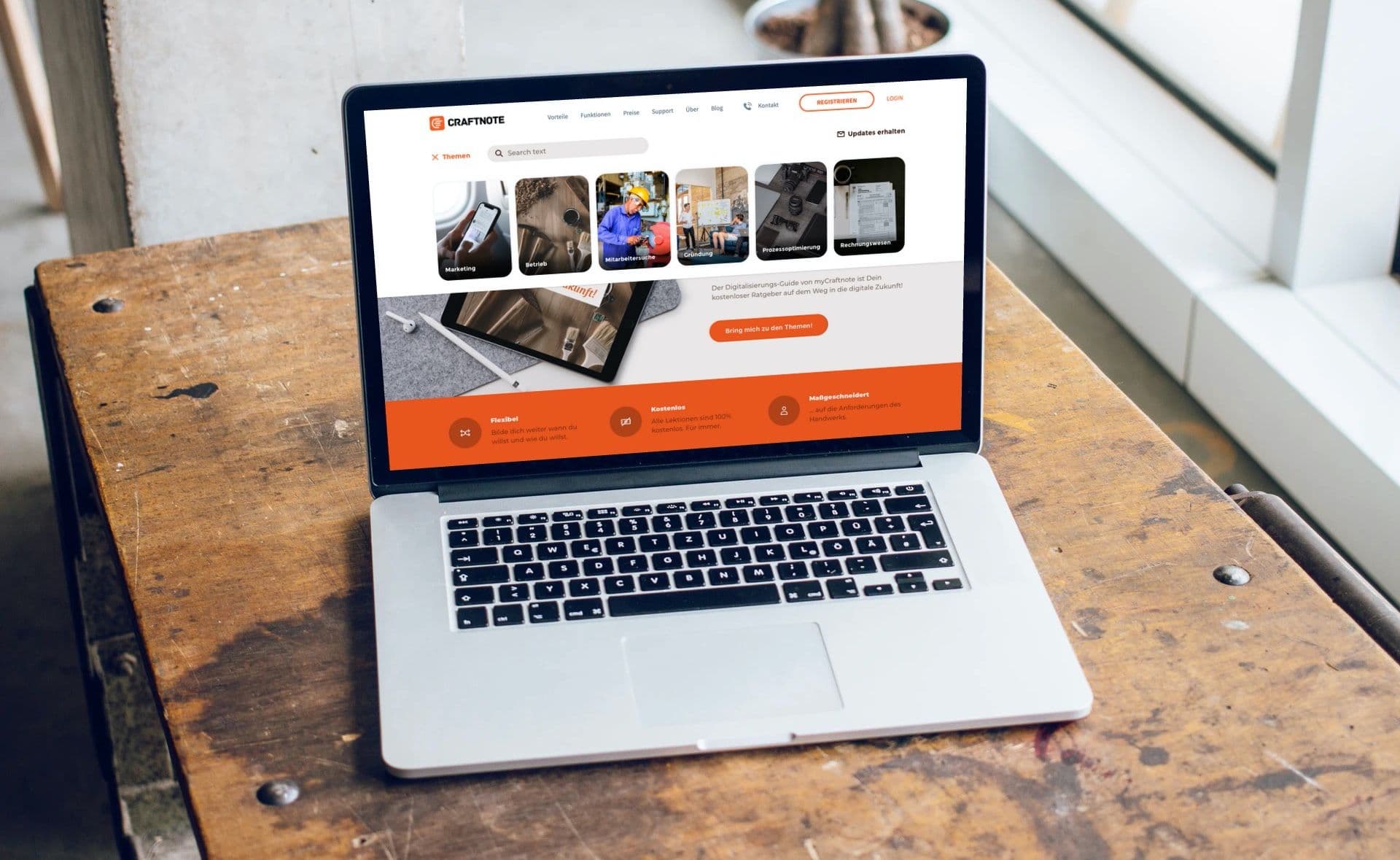
When it came to the actual Visual Design of the Guide, it was very important to me to make sure it fits in with the rest of the website. There was no Style Guide I was able or "had to" follow. So I was quite free when it came to deciding how closely my design needed to fit in. To make all feel consistent I especially looked at colors and shapes.
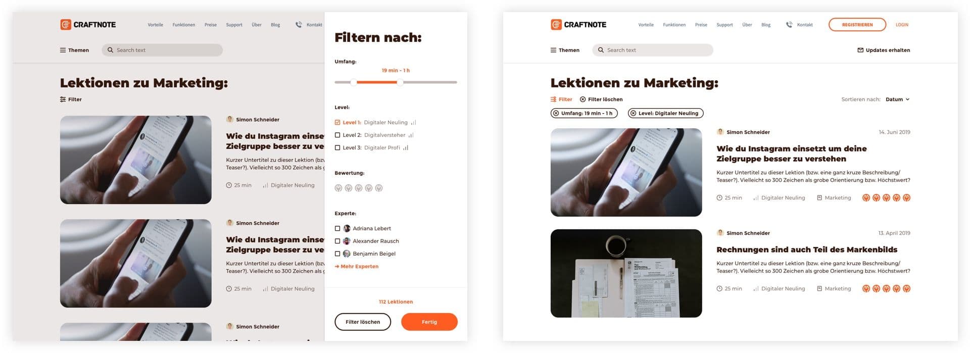
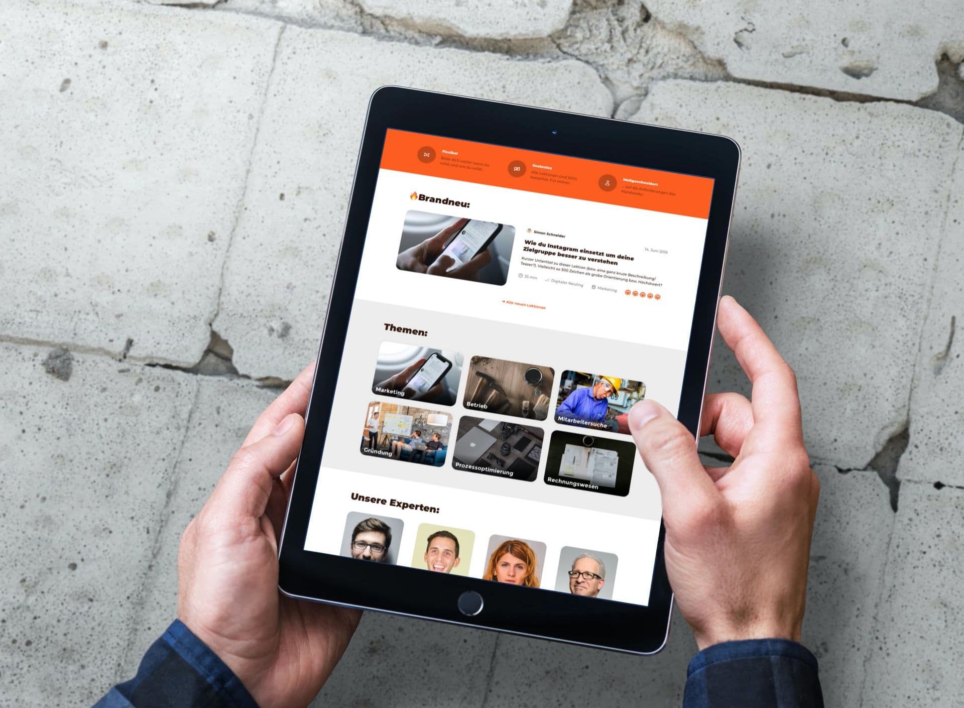
Providing visual guidance through design
Other than that, what was very important to me regarding the UI Design was to provide visual guidance and to make sure that the visitor is not overwhelmed. Since there is a lot of information that needs to be presented, this is even more important in projects like this then it already is the case in general.
The tools to guide the eye of the user
So I made sure to provide visual guidance by the use of colored blocks, varying spaces and sizes as well as typography and iconography – always with the goal in mind to guide the eye and make it easy for the user to make out groups and skim through the most important information.
Placeholder content – or rather not?
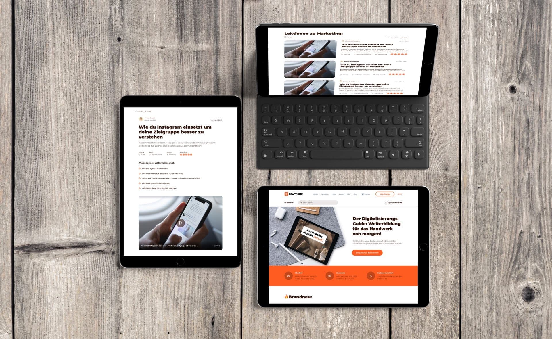
As you might be able to see in the pictures, I tend to mix placeholder content with actual content. I would prefer using the final content, but when I get to designing "the thing" the content is often not there yet. That happens due to the fact that we move so rapidly from first idea, to wireframes to UI Design.
So what I do most of the times is that I write the texts myself – wherever that is possible without to much effort – and I fall back on placeholder texts where the effort would be unproportionally high.
But why even bother? For me it makes a huge difference, especially in these early stages where I am still communicating and testing out the concept. The other thing is: In the end, it needs to work with real and not for example with idealized content. I try to get as close to that assumed end state as possible. Even though predicting it can get hard, when the content is user generated. For these situations I like to test out the different extremes.